This time, I wanted to answer a different question:
What happened when somebody saw the page more than once?
If they didn’t click the first time, was that opportunity gone?
Or could another exposure give the ad a second chance?
Most People Only Saw It Once
The final analysis included 8,392 recorded visits from 7,380 tracked visitor IDs.
Most of them appeared only once.
7,092 appeared once
288 appeared more than once
So only about 3.9% of the tracked visitors returned for another recorded exposure.
For this article, an exposure simply means another recorded page load under the same visitor ID.
That could have come from another mailing, a return visit, a delayed click, or even a refresh. It does not necessarily mean somebody received the exact same email twice.
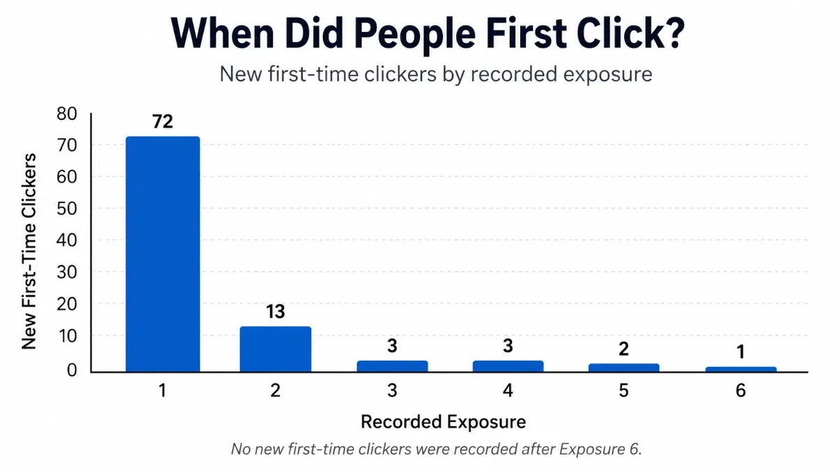
When Did People First Click?
There were 94 distinct tracked visitors who clicked the attention button at least once.
Here’s when they clicked for the first time:
The biggest takeaway is obvious.
72 of the 94 people who eventually clicked did it on their first recorded exposure.
That’s 76.6%.
So most of the attention happened right away.
But that also means 22 people — 23.4% of all eventual clickers — did not respond the first time.
Nearly one-quarter of the people who eventually clicked needed another opportunity.
That seems worth paying attention to.
The Second Exposure Was Especially Interesting
On Exposure #1, all 7,380 tracked visitors were eligible to become first-time clickers.
72 clicked.
That works out to a first-click rate of about 0.98%.
Now look at Exposure #2.
Among people who returned without having clicked the first time, 269 were still eligible to become first-time clickers.
13 of them clicked.
That works out to 4.83%.
So the first-click rate among those returners was nearly five times the rate on the first exposure.
That sounds dramatic.
But there’s an important catch.
The Second Group Was Different
I’d love to say the second exposure made people five times more likely to click.
The numbers don’t quite let me say that.
Everybody was included in Exposure #1.
Exposure #2 only included people who came back.
Those people may have been more active safelist users, more curious, more likely to revisit pages, or exposed to my campaign differently.
They were a self-selected group.
I didn’t randomly divide people into a “see it once” group and a “see it twice” group.
So this does not prove that repetition caused the higher click rate.
What it does show is that among the people who naturally returned without responding the first time, the second encounter created quite a few new responses.
That alone is useful.
A First Non-Response Wasn’t Always the End
This may be the most practical lesson for me.
It’s easy to run an ad, see that somebody didn’t respond, and assume the message failed.
Sometimes that may be true.
But in this experiment, 22 eventual clickers passed through once without clicking and responded later.
Thirteen responded on Exposure #2.
Another nine responded after that.
I can’t say exactly why.
Maybe the page looked more familiar.
Maybe they were less distracted the next time.
Maybe curiosity had another chance to work.
I don’t know.
What I do know is that one missed opportunity did not always mean the ad had lost them forever.
But More Repetition Wasn’t Automatically Better
The extra response also faded pretty quickly.
After the 13 new clickers on Exposure #2, the numbers dropped to:
3 on Exposure #3
3 on Exposure #4
2 on Exposure #5
1 on Exposure #6
0 after that
In this dataset, every tracked visitor who eventually clicked had done so by their sixth recorded exposure.
I would not turn that into some kind of “six exposure rule.”
The later groups were small, and this was one unusual advertising experiment.
To me, the pattern is simpler:
The first exposure did most of the work. The second created another useful opportunity. After that, new response became increasingly rare.
So How Long Should You Keep Running an Ad?
I don’t think this experiment gives us one perfect number.
What it does suggest is a reasonable middle ground.
If you have an ad that you believe is strong, don’t necessarily abandon it just because someone didn’t respond the first time.
Give it another chance.
Maybe even a few.
But don’t use repetition as an excuse to run the same ad forever either.
Eventually, you may be better off testing another headline, changing the creative, rotating the ad, or bringing it back again later.
For me, the takeaway is:
A first non-response is not always the end of the story.
Most people who noticed my experiment responded right away.
Some responded only after seeing it again.
And eventually, the supply of new attention dried up.
That feels a lot more useful than trying to force the results into some magic advertising rule.
There’s one more strange pattern hiding in the repeat-visitor data.
A small group didn’t just return and click for the first time.
They kept clicking on later visits even after they had already responded once.
I’ve spent a lot of time thinking about what makes an ad stand out, but this time I had something better than another theory: I could ask the people who actually noticed mine.
After somebody clicked the button on my safelist experiment page, I asked one more question:
What made you notice this page?
I gave them seven choices:
The email subject
The email itself
The headline
The eyes
The page design
Just curious
Other
By the end of the experiment, I had collected 105 answers.
And at first, the winner looked pretty obvious.
The eyes received 43 selections.
The next closest answer, the page design, received only 21.
So there you go.
Put a giant pair of eyes on every ad you create and retire rich.
Well…
Not quite.
Once I started looking more carefully at where those 105 answers came from, the result became a lot more interesting.
105 Answers Did Not Mean 105 Different People
This is one of those little details that can completely change how you interpret an experiment.
The 105 answer records came from 76 distinct tracked respondents.
Some people encountered the experiment more than once. If they clicked the attention button again on another visit, they could answer the follow-up question again.
Fourteen tracked respondents submitted more than one answer.
Altogether, those repeat participants created 29 additional answer records beyond their first responses.
That means I didn’t want to simply treat all 105 answers as though 105 different people had independently selected an answer.
So for the main comparison in this article, I used only the first recorded answer from each of the 76 distinct tracked respondents.
And suddenly, the eyes didn’t look nearly as dominant.
The page used for the Safelist Attention Project. Visitors were asked to confirm that they had deliberately noticed it.
What Did People Say Made Them Notice the Page?
Here is what the first answer from each of those 76 tracked respondents looked like:
Rank
Answer
Respondents
Share
1
The eyes
22
28.9%
2
The page design
21
27.6%
3
The headline
13
17.1%
4 tie
The email subject
8
10.5%
4 tie
Just curious
8
10.5%
6 tie
The email itself
2
2.6%
6 tie
Other
2
2.6%
Now that’s a much different story.
The eyes still finished first.
But only by one respondent.
Twenty-two people credited the eyes.
Twenty-one credited the overall page design.
That is basically a tie.
And I think that’s more useful than the original 43-to-21 comparison.
The Eyes Won… But They Didn’t Win the Way I Expected
I went into this experiment expecting the eyes to play a major role.
The page was deliberately unusual.
There was no sales pitch.
No opt-in form.
No income claim.
Not even a product to buy.
Instead, the page told people they were part of an experiment, showed a very noticeable pair of eyes, and asked them to click a button if they had actually stopped long enough to notice what they were seeing.
Looking only at all 105 recorded answers, my original assumption seemed completely justified:
The eyes: 43 answers
Page design: 21
Headline: 17
Email subject: 12
Just curious: 8
Email itself: 2
Other: 2
But something interesting happened among the repeat participants.
Of the 29 additional answers submitted after a respondent’s first answer:
21 selected the eyes again.
The other eight were split between the headline and email subject.
None of the additional answers selected page design.
So repeat participants were especially likely to select the eyes again.
Maybe that means the eyes were particularly memorable.
Maybe they continued to stand out when someone saw the experiment again.
Or maybe there is another explanation I haven’t considered.
The data can’t tell me exactly why.
But it does explain why the eyes look so overwhelmingly dominant in the full 105-answer total while barely edging out the page design when I count each tracked respondent only once.
Nearly Three-Quarters Credited Something on the Page
There is another way to look at these answers that I think may be even more useful.
I grouped the choices into three broad categories.
Page elements
The eyes: 22
Page design: 21
Headline: 13
Total: 56 of 76 respondents — 73.7%
Email elements
Email subject: 8
Email itself: 2
Total: 10 of 76 — 13.2%
Curiosity or other
Just curious: 8
Other: 2
Total: 10 of 76 — 13.2%
So when I asked these respondents what made the page noticeable, almost three out of four credited something they were seeing on the landing page itself.
I want to be careful with that conclusion.
It does not mean the email was unimportant.
Without the email, most of these people would never have reached the page in the first place.
The survey was also asked after they had already arrived and interacted with the page. The page was right there in front of them, while the email they had just left was no longer visible.
So there is probably some recency involved too.
Still, I think the result says something useful:
The email opened the door. Once they arrived, the page itself received most of the credit for getting noticed.
That fits nicely with something I found earlier in this experiment.
As I discussed in More Traffic or More Attention?, simply getting somebody to a page is not the same thing as getting their attention once they arrive.
This survey gave me a glimpse into what the people who did pay attention believed had helped.
The Eyes Were Part of the Design
It would be easy to turn this into an eyes-versus-page-design contest.
I don’t think that would be very useful.
The eyes were part of the page design.
They didn’t exist in isolation.
They were surrounded by a clean layout, a headline explaining what was happening, a short amount of text, and one very obvious green button.
So when 22 people picked the eyes and another 21 picked the page design, I don’t see those as two completely separate things fighting for first place.
My interpretation is more like this:
The eyes may have stopped them, but the rest of the page gave them a reason to stay long enough to click.
I can’t prove that’s exactly what happened.
But it makes more sense to me than concluding that everybody should start pasting giant eyeballs onto their splash pages.
Although I admit that would make safelist emails a little more entertaining.
The Headline Wasn’t Exactly a Loser Either
The headline finished third with:
13 of 76 respondents — 17.1%
That’s roughly one out of every six people.
I wouldn’t dismiss that.
One mistake I could make here would be to say that the experiment proves images beat words.
It doesn’t.
The visual may have been the first interruption.
The page design may have helped organize everything.
But the headline helped explain what the person was looking at.
But after you get that split second of attention, something still has to make sense.
The headline is often where that happens.
The Subject Line Beat the Email Body Four to One
The email results were also interesting.
Among the 76 first responses:
8 chose the email subject
2 chose the email itself
So the subject line was selected four times as often as the actual email.
Again, I don’t think the lesson is to stop caring about your email copy.
The email had already done its job by getting somebody to click through.
In this particular campaign, the subject line may have been the beginning of the attention sequence.
It created enough interest to get the email opened.
The email created enough interest to get the page opened.
Then the landing page had to do something with that opportunity.
That is probably a better way to think about the whole process than trying to identify one single magical element.
People Who Chose the Eyes Also Clicked Sooner
There was one more piece of data I wanted to look at.
Because I recorded the page visit and attention click separately, I could calculate how much time passed between the recorded page load and the click.
Again, I used each respondent’s first reason answer.
The median times looked like this:
What they credited
Respondents
Median time to attention click
The eyes
22
12 seconds
The headline
13
32 seconds
Page design
21
40 seconds
Email subject
8
40 seconds
Just curious
8
53 seconds
The people who credited the eyes tended to interact with the page much sooner.
Their median time from page load to clicking the attention button was only 12 seconds.
That is interesting.
But there is an important limitation.
This does not mean the eyes made somebody notice the page exactly 12 seconds after arriving.
I don’t know the exact moment attention began.
Someone could have opened the page in another tab.
They could have gotten distracted.
They could have come back later.
So I think the safest conclusion is simply:
People who credited the eyes tended to interact with the page sooner.
That certainly fits the idea of the eyes acting as a quick visual focal point, but I wouldn’t take it much further than that.
What I Would Take Into My Next Ad
The more I look at these results, the less interested I am in finding one winner.
I think the useful lesson is in how the pieces worked together.
If I were designing my next ad based on this experiment, here is what I would keep in mind.
Give the page one obvious visual focal point.
Something should immediately stand out from everything around it.
Don’t expect that focal point to rescue a weak page.
The overall design received almost exactly as much credit as the eyes.
Use the headline to explain or strengthen the visual.
One out of six respondents specifically credited the headline.
Make the next action obvious.
The experiment page didn’t make people hunt for what to do next.
There was one clear button.
Treat the subject line as the beginning of the experience.
The page doesn’t exist in a vacuum. The first opportunity to earn attention may happen before somebody ever reaches it.
And maybe most importantly:
Look at the entire path instead of optimizing each piece separately.
Subject line.
Email.
Landing page.
Visual.
Headline.
Action.
They all hand attention from one step to the next.
That is probably a better lesson than trying to discover whether eyes are 1.3% more powerful than some other picture.
What This Experiment Cannot Tell Me
As interesting as these results are, there are some limits worth remembering.
Only people who clicked the attention button were shown the follow-up question.
So these answers do not represent all 8,392 analyzed visits from the experiment.
They represent the respondents who had already deliberately interacted with the page.
The answers were also self-reported.
People told me what they believed made them notice the page. That does not prove that the selected item actually caused their attention.
The answer choices were predetermined.
There was an “Other” option, but I did not collect a written explanation with it, so I have no idea what those two respondents meant.
And because the page was still visible when the question was asked, it is possible those elements were simply easier to remember than the email that came before them.
This was also one page, one campaign, and one particular audience.
I would test these ideas again before treating any of them as universal rules.
So… Did the Eyes Work?
Yes.
I think it would be difficult to look at these results and say the eyes didn’t matter.
They finished first among distinct tracked respondents.
They were selected repeatedly by people who encountered the experiment more than once.
And respondents who credited the eyes tended to click sooner.
But the page design finished only one respondent behind them.
The headline mattered to a meaningful group too.
And even the email subject had a role before the page ever got a chance to do its job.
So I don’t think the lesson from this experiment is:
Use eyes.
I think it’s something closer to this:
Something has to interrupt the pattern.
Something has to make what you’re seeing understandable.
And something has to give you a reason to do something next.
The eyes may have been the first part of that sequence.
But they weren’t working alone.
In the last article, I found that there wasn’t just one way for a safelist to “win” the experiment.
Apparently, there wasn’t just one way for the ad itself to win attention either.
And that brings me to the next thing I want to look at.
Some people clicked the first time they saw the experiment.
Others didn’t respond until they encountered it again.
So next, I’m going to dig into repeat exposure.
Did seeing the same page a second time increase the chances that somebody would finally notice it?
And if repetition helped, how long did it keep helping before it stopped producing new attention?
One thing I’ve noticed over the years while studying what makes people notice an ad is that a lot of marketers keep running the exact same ads for way too long.
Same headline. Same image. Same colors. Same wording.
Day after day after day.
And after awhile, people stop noticing them.
Not because the ads are terrible. Not because the offer suddenly became bad.
But because the ad has become familiar.
I was thinking about this recently while browsing through safelists and traffic exchanges.
You start seeing the same marketers promoting the same things over and over again. Eventually some of those ads almost stop feeling like ads entirely.
They become part of the background.
Your brain already knows what it’s looking at before you even consciously process it. Your eyes just slide past automatically.
Then somebody changes something.
Maybe it’s a completely different image. Maybe it’s a strange headline. Maybe the ad suddenly has a different tone or feel from everything around it.
And immediately it stands out.
Not necessarily because it’s better.
Just because it feels different.
Familiarity Can Kill Attention
I think this happens much faster than most marketers realize, especially in environments where people are constantly scanning ads all day long.
Eventually even good ads lose their ability to interrupt attention.
And attention is really the first battle.
Because if nobody stops long enough to notice your ad, nothing else matters after that.
Not the landing page. Not the offer. Not the product.
None of it.
Why I Change Ads So Often
A lot of the time when I change ads, there isn’t some giant marketing strategy behind it.
Honestly, it’s mostly intuition.
Sometimes I just get the feeling that people have seen the same thing too many times.
So I’ll change:
– the image – the headline – the colors – the wording – sometimes the entire vibe of the ad
Even when I’m still promoting the exact same thing.
And very often the new version immediately starts getting more attention.
Not because the previous ad failed.
Just because the new one feels fresh again.
Something Interesting I’ve Noticed
One thing I’ve learned is that old ads don’t always stay “old.”
Sometimes an ad that completely stopped working suddenly starts working again months later.
That’s especially true in safelist marketing.
New people join constantly. Old members disappear. Activity changes. The audience shifts over time.
An ad that everybody ignored six months ago might suddenly feel brand new simply because most of the current audience hasn’t seen it in a long time.
That’s something I think a lot of marketers overlook.
Small Changes Can Make People Notice an Ad
A lot of times you don’t even need a completely new idea.
Sometimes all it takes is breaking the visual pattern people have gotten used to seeing.
Something slightly unexpected. Something that interrupts the autopilot scrolling for half a second.
That moment matters.
Because once somebody actually notices your ad, curiosity finally has a chance to kick in.
Final Thoughts
One thing this has reminded me is that marketing isn’t always about creating something completely new.
Sometimes it’s simply about making something feel new again.
Or presenting the same idea from a different angle.
Because in places like safelists and traffic exchanges, familiarity can make even good ads disappear into the background after awhile.
And sometimes the marketers getting the most attention aren’t the ones with the best offers.
They’re just the ones who still know how to stand out.