This time, I wanted to answer a different question:
What happened when somebody saw the page more than once?
If they didn’t click the first time, was that opportunity gone?
Or could another exposure give the ad a second chance?
Most People Only Saw It Once
The final analysis included 8,392 recorded visits from 7,380 tracked visitor IDs.
Most of them appeared only once.
7,092 appeared once
288 appeared more than once
So only about 3.9% of the tracked visitors returned for another recorded exposure.
For this article, an exposure simply means another recorded page load under the same visitor ID.
That could have come from another mailing, a return visit, a delayed click, or even a refresh. It does not necessarily mean somebody received the exact same email twice.
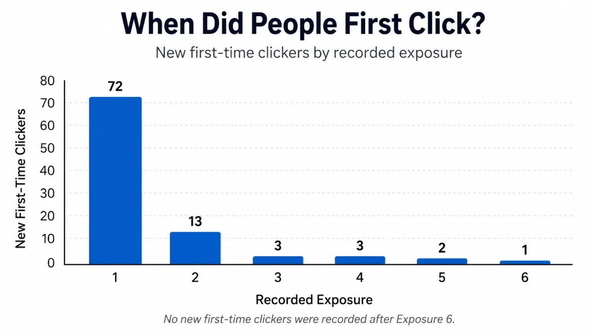
When Did People First Click?
There were 94 distinct tracked visitors who clicked the attention button at least once.
Here’s when they clicked for the first time:
The biggest takeaway is obvious.
72 of the 94 people who eventually clicked did it on their first recorded exposure.
That’s 76.6%.
So most of the attention happened right away.
But that also means 22 people — 23.4% of all eventual clickers — did not respond the first time.
Nearly one-quarter of the people who eventually clicked needed another opportunity.
That seems worth paying attention to.
The Second Exposure Was Especially Interesting
On Exposure #1, all 7,380 tracked visitors were eligible to become first-time clickers.
72 clicked.
That works out to a first-click rate of about 0.98%.
Now look at Exposure #2.
Among people who returned without having clicked the first time, 269 were still eligible to become first-time clickers.
13 of them clicked.
That works out to 4.83%.
So the first-click rate among those returners was nearly five times the rate on the first exposure.
That sounds dramatic.
But there’s an important catch.
The Second Group Was Different
I’d love to say the second exposure made people five times more likely to click.
The numbers don’t quite let me say that.
Everybody was included in Exposure #1.
Exposure #2 only included people who came back.
Those people may have been more active safelist users, more curious, more likely to revisit pages, or exposed to my campaign differently.
They were a self-selected group.
I didn’t randomly divide people into a “see it once” group and a “see it twice” group.
So this does not prove that repetition caused the higher click rate.
What it does show is that among the people who naturally returned without responding the first time, the second encounter created quite a few new responses.
That alone is useful.
A First Non-Response Wasn’t Always the End
This may be the most practical lesson for me.
It’s easy to run an ad, see that somebody didn’t respond, and assume the message failed.
Sometimes that may be true.
But in this experiment, 22 eventual clickers passed through once without clicking and responded later.
Thirteen responded on Exposure #2.
Another nine responded after that.
I can’t say exactly why.
Maybe the page looked more familiar.
Maybe they were less distracted the next time.
Maybe curiosity had another chance to work.
I don’t know.
What I do know is that one missed opportunity did not always mean the ad had lost them forever.
But More Repetition Wasn’t Automatically Better
The extra response also faded pretty quickly.
After the 13 new clickers on Exposure #2, the numbers dropped to:
3 on Exposure #3
3 on Exposure #4
2 on Exposure #5
1 on Exposure #6
0 after that
In this dataset, every tracked visitor who eventually clicked had done so by their sixth recorded exposure.
I would not turn that into some kind of “six exposure rule.”
The later groups were small, and this was one unusual advertising experiment.
To me, the pattern is simpler:
The first exposure did most of the work. The second created another useful opportunity. After that, new response became increasingly rare.
So How Long Should You Keep Running an Ad?
I don’t think this experiment gives us one perfect number.
What it does suggest is a reasonable middle ground.
If you have an ad that you believe is strong, don’t necessarily abandon it just because someone didn’t respond the first time.
Give it another chance.
Maybe even a few.
But don’t use repetition as an excuse to run the same ad forever either.
Eventually, you may be better off testing another headline, changing the creative, rotating the ad, or bringing it back again later.
For me, the takeaway is:
A first non-response is not always the end of the story.
Most people who noticed my experiment responded right away.
Some responded only after seeing it again.
And eventually, the supply of new attention dried up.
That feels a lot more useful than trying to force the results into some magic advertising rule.
There’s one more strange pattern hiding in the repeat-visitor data.
A small group didn’t just return and click for the first time.
They kept clicking on later visits even after they had already responded once.
I’ve spent a lot of time thinking about what makes an ad stand out, but this time I had something better than another theory: I could ask the people who actually noticed mine.
After somebody clicked the button on my safelist experiment page, I asked one more question:
What made you notice this page?
I gave them seven choices:
The email subject
The email itself
The headline
The eyes
The page design
Just curious
Other
By the end of the experiment, I had collected 105 answers.
And at first, the winner looked pretty obvious.
The eyes received 43 selections.
The next closest answer, the page design, received only 21.
So there you go.
Put a giant pair of eyes on every ad you create and retire rich.
Well…
Not quite.
Once I started looking more carefully at where those 105 answers came from, the result became a lot more interesting.
105 Answers Did Not Mean 105 Different People
This is one of those little details that can completely change how you interpret an experiment.
The 105 answer records came from 76 distinct tracked respondents.
Some people encountered the experiment more than once. If they clicked the attention button again on another visit, they could answer the follow-up question again.
Fourteen tracked respondents submitted more than one answer.
Altogether, those repeat participants created 29 additional answer records beyond their first responses.
That means I didn’t want to simply treat all 105 answers as though 105 different people had independently selected an answer.
So for the main comparison in this article, I used only the first recorded answer from each of the 76 distinct tracked respondents.
And suddenly, the eyes didn’t look nearly as dominant.
The page used for the Safelist Attention Project. Visitors were asked to confirm that they had deliberately noticed it.
What Did People Say Made Them Notice the Page?
Here is what the first answer from each of those 76 tracked respondents looked like:
Rank
Answer
Respondents
Share
1
The eyes
22
28.9%
2
The page design
21
27.6%
3
The headline
13
17.1%
4 tie
The email subject
8
10.5%
4 tie
Just curious
8
10.5%
6 tie
The email itself
2
2.6%
6 tie
Other
2
2.6%
Now that’s a much different story.
The eyes still finished first.
But only by one respondent.
Twenty-two people credited the eyes.
Twenty-one credited the overall page design.
That is basically a tie.
And I think that’s more useful than the original 43-to-21 comparison.
The Eyes Won… But They Didn’t Win the Way I Expected
I went into this experiment expecting the eyes to play a major role.
The page was deliberately unusual.
There was no sales pitch.
No opt-in form.
No income claim.
Not even a product to buy.
Instead, the page told people they were part of an experiment, showed a very noticeable pair of eyes, and asked them to click a button if they had actually stopped long enough to notice what they were seeing.
Looking only at all 105 recorded answers, my original assumption seemed completely justified:
The eyes: 43 answers
Page design: 21
Headline: 17
Email subject: 12
Just curious: 8
Email itself: 2
Other: 2
But something interesting happened among the repeat participants.
Of the 29 additional answers submitted after a respondent’s first answer:
21 selected the eyes again.
The other eight were split between the headline and email subject.
None of the additional answers selected page design.
So repeat participants were especially likely to select the eyes again.
Maybe that means the eyes were particularly memorable.
Maybe they continued to stand out when someone saw the experiment again.
Or maybe there is another explanation I haven’t considered.
The data can’t tell me exactly why.
But it does explain why the eyes look so overwhelmingly dominant in the full 105-answer total while barely edging out the page design when I count each tracked respondent only once.
Nearly Three-Quarters Credited Something on the Page
There is another way to look at these answers that I think may be even more useful.
I grouped the choices into three broad categories.
Page elements
The eyes: 22
Page design: 21
Headline: 13
Total: 56 of 76 respondents — 73.7%
Email elements
Email subject: 8
Email itself: 2
Total: 10 of 76 — 13.2%
Curiosity or other
Just curious: 8
Other: 2
Total: 10 of 76 — 13.2%
So when I asked these respondents what made the page noticeable, almost three out of four credited something they were seeing on the landing page itself.
I want to be careful with that conclusion.
It does not mean the email was unimportant.
Without the email, most of these people would never have reached the page in the first place.
The survey was also asked after they had already arrived and interacted with the page. The page was right there in front of them, while the email they had just left was no longer visible.
So there is probably some recency involved too.
Still, I think the result says something useful:
The email opened the door. Once they arrived, the page itself received most of the credit for getting noticed.
That fits nicely with something I found earlier in this experiment.
As I discussed in More Traffic or More Attention?, simply getting somebody to a page is not the same thing as getting their attention once they arrive.
This survey gave me a glimpse into what the people who did pay attention believed had helped.
The Eyes Were Part of the Design
It would be easy to turn this into an eyes-versus-page-design contest.
I don’t think that would be very useful.
The eyes were part of the page design.
They didn’t exist in isolation.
They were surrounded by a clean layout, a headline explaining what was happening, a short amount of text, and one very obvious green button.
So when 22 people picked the eyes and another 21 picked the page design, I don’t see those as two completely separate things fighting for first place.
My interpretation is more like this:
The eyes may have stopped them, but the rest of the page gave them a reason to stay long enough to click.
I can’t prove that’s exactly what happened.
But it makes more sense to me than concluding that everybody should start pasting giant eyeballs onto their splash pages.
Although I admit that would make safelist emails a little more entertaining.
The Headline Wasn’t Exactly a Loser Either
The headline finished third with:
13 of 76 respondents — 17.1%
That’s roughly one out of every six people.
I wouldn’t dismiss that.
One mistake I could make here would be to say that the experiment proves images beat words.
It doesn’t.
The visual may have been the first interruption.
The page design may have helped organize everything.
But the headline helped explain what the person was looking at.
But after you get that split second of attention, something still has to make sense.
The headline is often where that happens.
The Subject Line Beat the Email Body Four to One
The email results were also interesting.
Among the 76 first responses:
8 chose the email subject
2 chose the email itself
So the subject line was selected four times as often as the actual email.
Again, I don’t think the lesson is to stop caring about your email copy.
The email had already done its job by getting somebody to click through.
In this particular campaign, the subject line may have been the beginning of the attention sequence.
It created enough interest to get the email opened.
The email created enough interest to get the page opened.
Then the landing page had to do something with that opportunity.
That is probably a better way to think about the whole process than trying to identify one single magical element.
People Who Chose the Eyes Also Clicked Sooner
There was one more piece of data I wanted to look at.
Because I recorded the page visit and attention click separately, I could calculate how much time passed between the recorded page load and the click.
Again, I used each respondent’s first reason answer.
The median times looked like this:
What they credited
Respondents
Median time to attention click
The eyes
22
12 seconds
The headline
13
32 seconds
Page design
21
40 seconds
Email subject
8
40 seconds
Just curious
8
53 seconds
The people who credited the eyes tended to interact with the page much sooner.
Their median time from page load to clicking the attention button was only 12 seconds.
That is interesting.
But there is an important limitation.
This does not mean the eyes made somebody notice the page exactly 12 seconds after arriving.
I don’t know the exact moment attention began.
Someone could have opened the page in another tab.
They could have gotten distracted.
They could have come back later.
So I think the safest conclusion is simply:
People who credited the eyes tended to interact with the page sooner.
That certainly fits the idea of the eyes acting as a quick visual focal point, but I wouldn’t take it much further than that.
What I Would Take Into My Next Ad
The more I look at these results, the less interested I am in finding one winner.
I think the useful lesson is in how the pieces worked together.
If I were designing my next ad based on this experiment, here is what I would keep in mind.
Give the page one obvious visual focal point.
Something should immediately stand out from everything around it.
Don’t expect that focal point to rescue a weak page.
The overall design received almost exactly as much credit as the eyes.
Use the headline to explain or strengthen the visual.
One out of six respondents specifically credited the headline.
Make the next action obvious.
The experiment page didn’t make people hunt for what to do next.
There was one clear button.
Treat the subject line as the beginning of the experience.
The page doesn’t exist in a vacuum. The first opportunity to earn attention may happen before somebody ever reaches it.
And maybe most importantly:
Look at the entire path instead of optimizing each piece separately.
Subject line.
Email.
Landing page.
Visual.
Headline.
Action.
They all hand attention from one step to the next.
That is probably a better lesson than trying to discover whether eyes are 1.3% more powerful than some other picture.
What This Experiment Cannot Tell Me
As interesting as these results are, there are some limits worth remembering.
Only people who clicked the attention button were shown the follow-up question.
So these answers do not represent all 8,392 analyzed visits from the experiment.
They represent the respondents who had already deliberately interacted with the page.
The answers were also self-reported.
People told me what they believed made them notice the page. That does not prove that the selected item actually caused their attention.
The answer choices were predetermined.
There was an “Other” option, but I did not collect a written explanation with it, so I have no idea what those two respondents meant.
And because the page was still visible when the question was asked, it is possible those elements were simply easier to remember than the email that came before them.
This was also one page, one campaign, and one particular audience.
I would test these ideas again before treating any of them as universal rules.
So… Did the Eyes Work?
Yes.
I think it would be difficult to look at these results and say the eyes didn’t matter.
They finished first among distinct tracked respondents.
They were selected repeatedly by people who encountered the experiment more than once.
And respondents who credited the eyes tended to click sooner.
But the page design finished only one respondent behind them.
The headline mattered to a meaningful group too.
And even the email subject had a role before the page ever got a chance to do its job.
So I don’t think the lesson from this experiment is:
Use eyes.
I think it’s something closer to this:
Something has to interrupt the pattern.
Something has to make what you’re seeing understandable.
And something has to give you a reason to do something next.
The eyes may have been the first part of that sequence.
But they weren’t working alone.
In the last article, I found that there wasn’t just one way for a safelist to “win” the experiment.
Apparently, there wasn’t just one way for the ad itself to win attention either.
And that brings me to the next thing I want to look at.
Some people clicked the first time they saw the experiment.
Others didn’t respond until they encountered it again.
So next, I’m going to dig into repeat exposure.
Did seeing the same page a second time increase the chances that somebody would finally notice it?
And if repetition helped, how long did it keep helping before it stopped producing new attention?
After publishing the first two parts of my Safelist Attention Project, there’s an obvious question:
So which safelist was actually the best?
The more I look at the numbers, the less I think that question has one answer.
That may sound like I’m trying to avoid choosing a winner.
I’m not.
The problem is that changing the measurement changes which safelists stand out.
One platform may send the most traffic. Another may produce the highest percentage of interaction. Another may reach more different responsive people. And another may generate a surprisingly strong response from only a few mailings.
Those are all useful results.
They just represent different kinds of strength.
A Quick Refresher
For this experiment, I sent the same unusual campaign through 45 different safelists.
The page wasn’t selling anything and didn’t ask visitors to join a list.
It simply explained that they were part of an attention experiment and invited them to click one button to confirm they had noticed the page.
The campaign produced:
389 confirmed safelist sends
8,433 raw recorded visits
8,392 final named-source, human-likely analyzed visits
143 attention clicks
94 distinct tracked clickers
That worked out to an overall analyzed attention rate of 1.70%.
Now it’s time to look at the full safelist experiment results and see which platforms stood out under each measurement.
Instead of creating one universal ranking, I ranked the safelists four different ways.
1. Which Safelists Had the Highest Attention Rate?
The attention rate measures how often an analyzed visit resulted in a click on the experiment button.
For this ranking, I required at least 100 analyzed visits.
Without a minimum sample, a safelist could jump to the top based on one click from only a handful of visitors. Requiring 100 visits doesn’t make the results conclusive, but it gives us something more substantial to compare.
SendCircle was the clear attention-rate leader in this particular experiment.
Its 174 visits generated 32 clicks from 20 different tracked visitors. That is an unusually strong level of interaction for the amount of traffic it delivered.
Zodiac Mailer produced a different kind of interesting result.
Its 6.30% rate placed it second among qualifying safelists, but its eight clicks came from only two tracked visitors.
I don’t see that as a reason to dismiss the result.
It tells us that a small number of visitors became unusually engaged and interacted more than once.
That isn’t broad participation, but repeat engagement can still be valuable—especially for advertising intended to build recognition through repeated exposure.
My Daily Mailer, Click Leverage, and List Avail rounded out the top five with similar attention rates, although their traffic volume and participation patterns were quite different.
This is why attention rate is useful, but incomplete.
It tells me how frequently visits produced the measured action.
It doesn’t tell me how much traffic was delivered or how many different people responded.
2. Which Safelists Delivered the Most Reach?
If my only goal were reach, the leaderboard would look completely different.
These were the five sources that produced the most analyzed visits:
European Safelist was the reach leader, producing 1,206 analyzed visits from 12 confirmed sends.
That gave the experiment page more than 1,200 opportunities to be seen.
My Daily Mailer also crossed the 1,000-visit mark, while List Joe and Mister Safelist finished almost even at 671 and 668 visits.
I Love Traffic completed the top five with 578 visits.
It would be easy to look at an attention-rate table and overlook what these platforms accomplished.
They delivered people.
Traffic volume does not guarantee attention or conversions, but nothing can happen until somebody reaches the page.
Reach is a genuine strength, especially when the advertiser’s goal includes visibility, brand exposure, or gathering enough traffic to test a page properly.
It simply answers a different question:
How many opportunities did the safelist create for my page to be seen?
3. Which Safelists Produced the Broadest Unique Attention?
Total clicks are useful, but they don’t always reveal how many different visitors participated.
One person clicking several times creates a different pattern from several people each clicking once.
So for this ranking, I counted distinct tracked clickers.
SendCircle finished first again, but the result was much closer than the attention-rate ranking might suggest.
It generated responses from 20 distinct tracked visitors.
My Daily Mailer was only one behind with 19, despite reaching its total through a very different combination of traffic and attention rate.
Mister Safelist may have produced the cleanest example of broad participation.
It recorded 14 attention clicks from 14 different tracked visitors.
Every measured interaction came from somebody different. There were no repeat clickers adding multiple clicks to its total.
Click Leverage also showed strong breadth, with eight distinct tracked visitors producing ten clicks.
List Joe and Fast List Mailer each reached four distinct clickers. List Joe appears fifth under the ranking rules because it generated six total clicks compared with Fast List Mailer’s five.
This category may be especially useful when I want to know whether a response was spread across the audience rather than concentrated among a few highly active visitors.
Neither pattern is automatically better.
They simply tell me something different about what happened behind the click total.
4. Which Safelists Produced the Most Attention per Confirmed Send?
This may be the most practical new measurement for somebody who mails safelists regularly.
Sending an advertisement takes time, even when it has become part of your normal routine.
So I wanted to know:
What did I get back from each confirmed send under the accounts I was actually using?
SendCircle generated eight attention clicks for every confirmed campaign send.
That is an impressive result, but it also came from only four sends. A smaller number of sends makes the figure more sensitive to this particular campaign and period.
My Daily Mailer generated 2.5 clicks and approximately 1.58 distinct tracked clickers per send across 12 confirmed mailings.
Mister Safelist produced approximately 1.17 clicks per send, with every one of those clicks representing a different tracked visitor.
Click Leverage and Fast List Mailer both generated approximately 0.83 clicks and 0.67 unique clickers per send.
European Safelist and I Love Traffic also averaged approximately 0.83 clicks per send, but their clicks were more concentrated among repeat participants. That pushed Click Leverage and Fast List Mailer higher when distinct participation was considered.
This is not a controlled cost-efficiency comparison.
My membership levels, mailing privileges, audience reach, and mailing intervals were not identical at every safelist.
The measurement only shows what I received from each confirmed send using my existing accounts and normal routine.
Even with that limitation, I find it useful.
If my available mailing time is limited, response per send gives me another way to decide where that time may be producing noticeable engagement.
Several Safelists Looked Strong From More Than One Angle
The category tables also revealed several platforms that kept appearing for different reasons.
My Daily Mailer combined major reach with the second-highest total number of attention clicks and the second-most distinct tracked clickers.
Click Leverage didn’t lead any single category, but it repeatedly appeared near the top. It produced meaningful traffic, an above-average attention rate, good unique participation, and a solid response per mailing.
Mister Safelist stood out for reach and broad participation. Its 14 clicks coming from 14 different tracked visitors was one of the cleanest unique-attention patterns in the experiment.
Fast List Mailer produced a solid qualifying attention rate and good unique response from only six confirmed sends.
List Avail had the smallest sample among the top five attention-rate leaders, but each of its three clicks came from a different tracked visitor.
Zodiac Mailer showed that concentrated repeat engagement is another way a platform can produce an interesting result.
Full disclosure: I own My Daily Mailer and Mister Safelist, so familiarity with me, my writing, or my advertising may have influenced their results.
That doesn’t make the numbers meaningless, but it is part of the context.
Why I Like This Better Than One Master Ranking
I’ve published plenty of safelist rankings over the years.
Usually I’m measuring traffic, conversions, or some combination of the two.
This experiment reminded me that a ranking is only useful when I understand what the ranking is supposed to measure.
Suppose I’m promoting something that benefits from as much exposure as possible.
Reach may be the most important number.
Suppose I’m testing an interactive splash page and want to know how often visitors respond to something on it.
Attention rate becomes more interesting.
Suppose I want to know whether the response was spread across the audience.
Distinct tracked clickers may matter more.
Suppose I have limited time for daily submissions.
Response per confirmed send may help me decide where that effort seems most productive.
And if I’m building recognition for an evergreen brand or message, repeat exposure may not be a bad thing at all.
This experiment did not prove which metric would lead to the most opt-ins or sales in each of those situations.
It measured one specific deliberate interaction with one specific page.
But it did show why I shouldn’t automatically use the same definition of “best” for every advertising goal.
A Ranking Is Only as Good as the Question
There was no single safelist that owned every kind of performance.
European Safelist delivered the most reach.
SendCircle produced the highest qualifying attention rate, the most total attention clicks, and the most distinct tracked clickers.
My Daily Mailer combined substantial reach with strong total and unique attention.
Mister Safelist produced unusually broad participation without repeat clickers.
Click Leverage was consistently strong across several measurements.
Other platforms stood out through smaller samples, repeat engagement, or good response from fewer confirmed sends.
That makes the answer to “Which safelist was best?” a little frustrating.
It also makes it more useful.
Before I ask which safelist ranks first, I probably need to decide what I’m ranking it for.
The better question is: Best at what?
What Comes Next
The traffic-source data told me where the visitors came from.
But after somebody clicked the experiment button, I asked another question:
What made you notice the page in the first place?
I collected 105 answers.
Those answers may prove even more useful than the rankings because they begin to explain what was happening inside the visitor’s head when the page caught their attention.
In the last two posts I shared the setup for a simple safelist experiment and then walked through the results.
The idea was straightforward.
Instead of promoting an offer or trying to build my list, I asked visitors to do something very simple.
Click a button.
No opt-in form. No sales pitch. No reward.
Just curiosity.
Over the course of about a week the page received 4,047 visits and 357 button clicks across 40 safelists.
The numbers themselves were interesting, but after spending some time looking through the data I started thinking about something a little deeper.
What exactly was this experiment measuring?
What This Experiment Was Really Measuring
This wasn’t a conversion test.
It wasn’t a landing page test.
And it definitely wasn’t measuring sales or signups.
What it really measured was voluntary interaction.
Someone had to:
– land on the page – read what was written – understand the experiment – decide to click the button
That’s a higher bar than the normal safelist browsing process.
Which means the clicks in this experiment probably say more about attention than anything else.
Different Safelists Encourage Different Behavior
One thing became very clear while looking at the results.
Safelists don’t all behave the same way.
The same splash page ran on 40 different platforms during the same time period.
Yet the engagement levels were dramatically different.
There are probably two main reasons for that.
Community Activity
Some safelists simply have more active communities.
More members are opening mailings and browsing the ads.
That naturally leads to more interaction.
Platform Design
The structure of the mailer itself can also influence how people behave.
Some platforms make it very easy to earn credits quickly. When that happens, people tend to move through pages faster.
Other systems encourage members to spend a little more time looking at what’s on the screen.
Both factors affect how ads are experienced.
The Big Standout
One result from the experiment stood out immediately.
My Daily Mailer produced a participation rate that was dramatically higher than anything else in the test.
There are probably a few reasons for that.
The community is very active, and the platform includes Lucky Letters, which are messages that sometimes contain prizes. That naturally encourages members to actually look at the pages they land on.
It’s also possible that my ad simply stood out more there since members are already familiar with me on that platform.
Whatever the reason, the difference was noticeable.
A Couple Interesting Outliers
While reviewing the data, a couple of smaller mailers also caught my attention.
But the visitors they did send interacted with the page at a surprisingly high rate.
That’s always interesting to see.
Sometimes smaller communities can produce more attentive traffic simply because there are fewer members and people spend a little more time browsing the ads.
With a larger dataset it would be interesting to see if that pattern continues.
Traffic Volume vs Engagement
Another thing that stood out in the data was the relationship between traffic volume and engagement.
Some safelists sent a lot of visitors but relatively few clicks.
Others sent fewer visitors but a much higher percentage of interaction.
That doesn’t necessarily mean one type of traffic is better than the other.
It just shows that different communities interact with ads in different ways.
Why I Enjoy Running Experiments Like This
One of the reasons I enjoyed this experiment so much is that it reminded me of something I used to do regularly.
Years ago I used to publish monthly safelist statistics showing which platforms were producing the most list signups.
Those posts were always fun because they showed real data from actual campaigns.
This experiment felt a little like returning to that idea, but from a different angle.
Instead of measuring signups, I was simply measuring interaction.
And sometimes that tells us just as much.
What I Might Experiment With Next
This experiment answered some questions, but it also created a few new ones.
For example:
– Would the results change if the experiment ran longer? – Would traffic exchanges show similar behavior? – What would happen if the page offered an incentive instead of pure curiosity?
I may explore some of those ideas in the future.
For now, I’m glad I ran this experiment.
It turned out to be a fun way to look at safelist traffic from a slightly different perspective.
And as always, I appreciate everyone who took a moment to participate.
In my last post, I explained the idea behind a small safelist experiment I decided to run.
Instead of promoting an offer or trying to build my list, I asked visitors to do something very simple.
Click a button.
There was no reward for clicking it. No redirect. No opt-in form.
Just a simple invitation to participate in the experiment.
The goal was to see how many visitors arriving from safelists would actually interact with the page.
Now that the experiment is finished, we can look at the numbers.
Overall Experiment Results
Over the course of about a week, I promoted the splash page on 40 different safelists.
Here are the totals.
Metric
Result
Safelists Tested
40
Total Visits
4,047
Participation Clicks
357
Overall Participation Rate
8.82%
Considering there was no incentive to click the button, I thought this was pretty interesting.
The button was clicked 357 times during the experiment.
Since I didn’t track IP addresses, that number represents total clicks rather than unique participants.
Visitors were allowed to click the button once per safelist per day, so some people may have participated more than once if they saw the experiment on multiple sites.
Top Safelist Traffic Sources
First, let’s look at which safelists delivered the most visitors.
Just the top three safelists generated more than half of all participation clicks in the experiment.
The Big Outlier
One result stood out immediately when I started looking through the numbers.
My Daily Mailer
Visits
Clicks
CTR
471
134
28.45%
That participation rate was dramatically higher than anything else in the experiment.
There are probably a few reasons for this.
First, My Daily Mailer has a very active community.
Second, the platform includes “Lucky Letters” — messages that look like normal ads but sometimes contain prizes. That tends to encourage members to actually look at the pages they land on instead of just clicking through them.
And finally, it’s possible my ad simply stood out more on that platform since my picture appears on the page and members are already familiar with me there.
Whatever the reason, the difference was significant.
What the Data Suggests
One thing this experiment reinforces is something I’ve believed for a long time.
Safelists are not all the same.
Some communities are more active than others.
And the design of the platform itself can influence how members interact with ads.
Same splash page. Same message. Same time period.
Yet the engagement levels varied dramatically depending on the safelist.
That’s part of what makes experiments like this interesting.
Final Thoughts
I originally ran this experiment because I missed publishing safelist statistics like I used to.
It turned out to be a fun way to look at safelist traffic from a slightly different perspective.
Instead of measuring signups or conversions, this experiment simply measured curiosity.
And based on the results, there are clearly a lot of curious safelist users out there.
Thanks again to everyone who took a moment to participate.